28 May 2020

This is part three of a series on refactoring themes and styles — it’ll make sense without reading the other parts, but if you want the full picture, start reading here.
Theme overlays are used to override values from your theme. At Monzo, we leverage theme overlays in different ways and this post highlights three cases where we’ve found using them to be helpful.
Most of the toolbars in the Monzo app have the same color as the screen’s background, which is defined by the activity theme, but there are other cases where we want a distinct color (data is made up):
| Loans flow screen 1 | Screen 2 |
|---|---|
 |
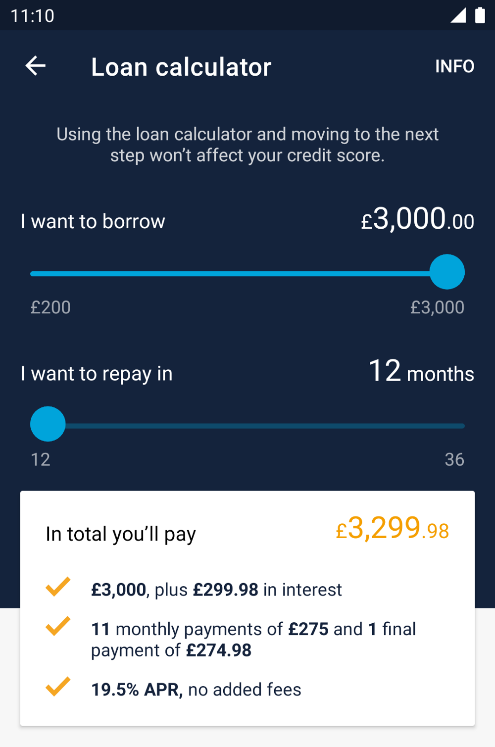 |
Our loan application flow transitions from light-themed screens to one where the top half of the screen is navy.
We could set the background color for the toolbar explicitly, but then we’d have to also update the text color, the navigation icon color, action menu item colors etc.
Instead, using a theme overlay we can override colorPrimary and colorOnPrimary, so that anything referencing those two attributes use our new values instead:
<style name="ThemeOverlay.Monzo.Toolbar.Loans" parent="">
    <item name="colorPrimary">@color/navy</item>
    <item name="colorOnPrimary">@color/white</item>
</style>
The way we specify this in the layout is using android:theme, which applies the overlay to the view and its descendants:
<androidx.appcompat.widget.Toolbar
    android:id="@+id/loanCalculatorToolbar"
    android:layout_width="match_parent"
    android:layout_height="wrap_content"
    android:theme="@style/ThemeOverlay.Monzo.Toolbar.LoansNavy" />
In the previous post, we wrote about Android’s default styles and how we use them to apply app-wide changes. Unfortunately, android:theme doesn’t work when specified in a default style.
The view inflater is applies theme overlays by checking to see whether android:theme is specified, then using ContextThemeWrapper to wrap Context with the overlay, before using that wrapped context to instantiate the view. Default styles are read after the view is instantiated, and the default style attributes are defined inside the two-argument view constructor, which means the view inflater is unable to check the view’s default style for the android:theme attribute. Since android:theme is read and applied by the view inflater, which doesn’t have access to an arbitrary view’s default style attribute, android:theme is ignored when specified in a resource that’s used as as default style.
Thankfully, there’s another view attribute, materialThemeOverlay, which is supported by a bunch of components from the Material Design Components for Android library, and this does work in default styles. To learn more about why, check out Using Material Theme Overlay.
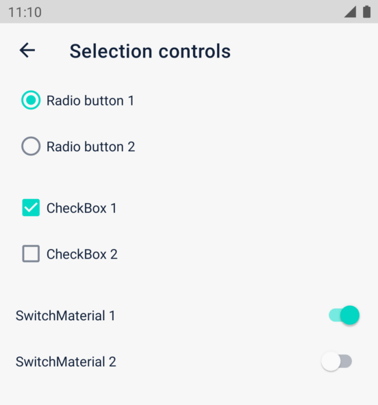
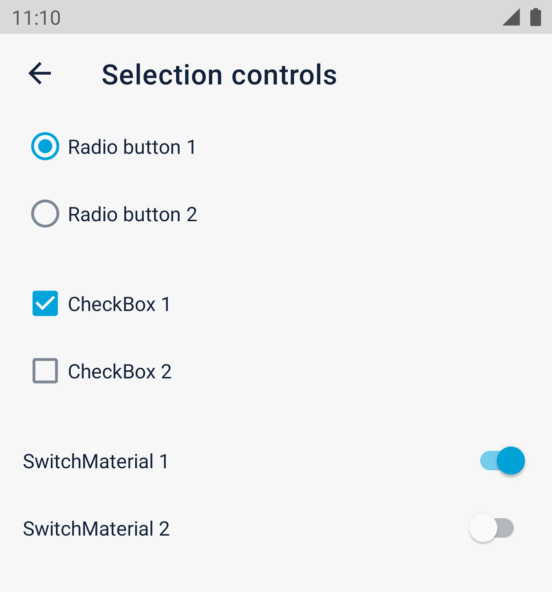
One use case for this is updating the colors used by selection controls:
By default, these components use colorSecondary as the main color, but in the Monzo app, we want them to use the same blue tint that we use for buttons (a custom attribute we defined as mdsColorBlueTint).
<style name="ThemeOverlay.Monzo.CompoundButton" parent="">
    <item name="colorSecondary">?attr/mdsColorBlueTint</item>
</style>
After defining a theme overlay which overrides colorSecondary to point to the color we want, we can use materialThemeOverlay to reference this resource in our default styles:
<style name="Widget.Monzo.CompoundButton.CheckBox" parent="Widget.MaterialComponents.CompoundButton.CheckBox">
    <item name="android:textColor">?attr/mdsColorPrimaryContent</item>
    <item name="materialThemeOverlay">@style/ThemeOverlay.Monzo.CompoundButton</item>
</style>

<style name="Widget.Monzo.CompoundButton.RadioButton" parent="Widget.MaterialComponents.CompoundButton.RadioButton">
    <item name="android:textColor">?attr/mdsColorPrimaryContent</item>
    <item name="materialThemeOverlay">@style/ThemeOverlay.Monzo.CompoundButton</item>
</style>

<style name="Widget.Monzo.CompoundButton.Switch" parent="Widget.MaterialComponents.CompoundButton.Switch">
    <item name="android:textColor">?attr/mdsColorPrimaryContent</item>
    <item name="materialThemeOverlay">@style/ThemeOverlay.Monzo.CompoundButton</item>
</style>
| Before | After |
|---|---|
 |
 |
We could have updated colorSecondary in our theme, but what other components could be using that? It’s safer to limit the scope of changes by using materialThemeOverlay directly in the default style for the components we want to change.
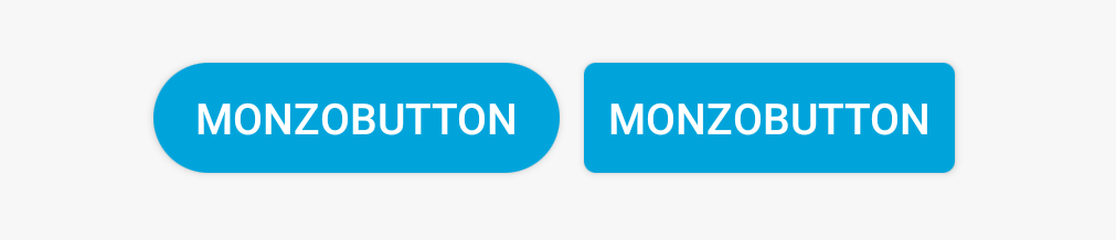
The last way we use theme overlays is in code. Our custom button class, MonzoButton, can be displayed with very rounded corners so that it looks like a pill.
This works using a custom theme attribute called monzoButtonCornerRadius which is referenced in our background shape drawables:
<shape android:shape="rectangle">
    <corners android:radius="?attr/monzoButtonCornerRadius" />
        <!-- ... -->
The default value is 4dp but if we set it to some ludicrously large value like 1000dp, it seems to be capped to half of the view’s height which gives us a fully-rounded corner effect.
<style name="ThemeOverlay.Monzo.MonzoButton.Pill" parent="">
    <!-- any value larger than `button.height / 2` -->
    <item name="monzoButtonCornerRadius">1000dp</item>
</style>
We could use this overlay with android:theme in our layout but we decided to control this programmatically, leaving android:theme free for other cases.
Instead, we added a custom view attribute, isPill, and applied the theme overlay programmatically when the view is created:
private val DEF_STYLE_ATTR = R.attr.monzoButtonStyle

class MonzoButton(ctx: Context, attrs: AttributeSet) : AppCompatButton(
        wrapContext(ctx, attrs),
        attrs,
        DEF_STYLE_ATTR
) {

    companion object {
        fun wrapContext(context: Context, attrs: AttributeSet): Context {
            val materialContext = MaterialThemeOverlay.wrap(context, attrs, DEF_STYLE_ATTR, 0)
            val typedArray = materialContext.obtainStyledAttributes(attrs, R.styleable.MonzoButton, DEF_STYLE_ATTR, 0)
            val isPill = typedArray.getBoolean(R.styleable.MonzoButton_isPill, false)
            typedArray.recycle()
            return if (isPill) {
                return ContextThemeWrapper(materialContext, R.style.ThemeOverlay_Monzo_MonzoButton_Pill)
            } else {
                materialContext
            }
        }
    }
First, we add support for materialThemeOverlay by using the MaterialThemeOverlay.wrap() function on the Context passed to the constructor.
Then we check whether isPill is true, applying our theme overlay with ContextThemeWrapper if so, else returning the Context wrapped by the Material Design Components function.
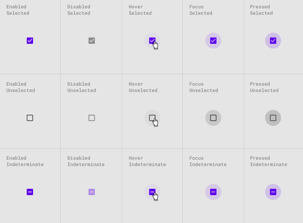
Theme overlays allow us to make hugely impactful changes with relatively little code. There’s a risk of too much indirection, so this needs to be balanced. For example, using overlays to change the color of a checkbox is trivial, compared to providing a custom background which supports all these states:
In the end, both you and your team need to have confidence in the changes you’re making to your themes. In the next post, we’ll take a look at how “gallery” apps can help increase confidence in these changes.
In the meantime, if you have any questions reach out on Twitter!
I wrote about how we use theme overlays in the @MakingMonzo Android app, as part of the Refactoring Themes with Style series (3/5).https://t.co/bQo5DEuRRK #gde #androiddev
— ataúl ✏️ (@ataulm) May 28, 2020
Thanks @spectrl and @crafty for the 👀!