14 October 2019
I watched Developing Themes with Style a couple of weeks ago and learned everything about themes and styles that I’d deferred for the last six years.
@chrisbanes 😍 this diagram (and preceding guide) is what I needed in my life. right now. pic.twitter.com/vsKBILYZyr
— a-ta-ul 🎫 (@ataulm) September 28, 2019
One of the concepts that was new to me was theme overlays. It’s a powerful technique that allows us to override only the attributes that are specified in the overlay itself.
The typical way to apply a theme overlay is using the android:theme attribute on our view. This post summarises how we can do this, as well as introducing materialThemeOverlay, a theme attribute that (kind of) lets us set a theme overlay on a default style.
In AndroidManifest.xml, we’ll set the app theme by specifying the theme attribute on the application element, android:theme="@style/Theme.Demo". Our theme defines the colorPrimary theme attribute:
<style name="Theme.Demo" parent="Theme.MaterialComponents.DayNight.NoActionBar">
  <item name="colorPrimary">@color/material_red_500</item>
</style>
<LinearLayout
  android:layout_width="match_parent"
  android:layout_height="match_parent">

  <com.google.android.material.button.MaterialButton
    android:layout_width="match_parent"
    android:layout_height="wrap_content"
    android:text="Apply" />

  <com.google.android.material.button.MaterialButton
    style="@style/Widget.MaterialComponents.Button.TextButton"
    android:layout_width="match_parent"
    android:layout_height="wrap_content"
    android:text="Cancel" />
</LinearLayout>

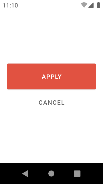
Our layout has two buttons, which are now red. MaterialButton uses the theme’s colorPrimary attribute as its… primary color. That red “cancel” button is very prominent though, let’s change it to gray.
While we could just set the android:textColor on the view directly, we’d still have a red ripple, which we don’t want. Also, we’re unable to change colorPrimary in Theme.Demo because that would affect everything in our app (like “apply”).
Instead, let’s use a theme overlay:
...

<style name="ThemeOverlay.Demo.GrayPrimary" parent="">
  <item name="colorPrimary">@color/gray</item>
</style>
...

<com.google.android.material.button.MaterialButton
  style="@style/Widget.MaterialComponents.Button.TextButton"
  android:layout_width="match_parent"
  android:layout_height="wrap_content"
  android:text="Cancel"
  android:theme="@style/ThemeOverlay.Demo.GrayPrimary" />
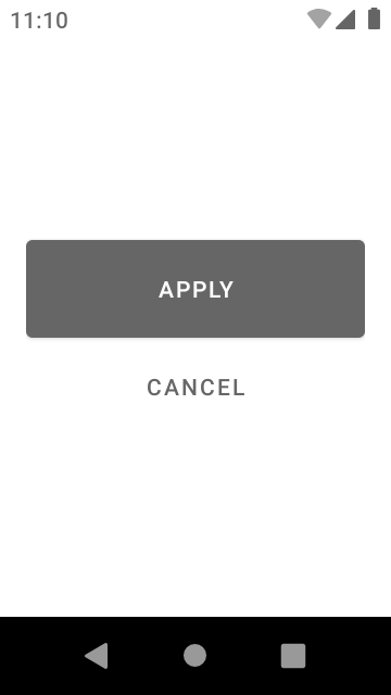
This overlays the ThemeOverlay.Demo.GrayPrimary theme on top of Theme.Demo, for this specific button only. Since we only specified colorPrimary, only this attribute is overridden, and so any usages of colorPrimary for this button (or if it was a view group, any of its descendants) will resolve as gray:

A theme overlay isn’t much different from a regular style/theme. We explicitly set a null parent (parent="") so that we could be sure that we weren’t accidentally override attributes from any theme ancestors.
The LayoutInflater class will read android:theme and use a ContextThemeWrapper to layer this overlay on top of any ancestor overlays or themes. (See AppCompatViewInflater if using AppCompatActivity or MaterialComponentsViewInflater if using a Material theme).
It’s like an onion with many layers; if a theme attribute is requested, it’ll start from the outside and peel away layers until it finds the target. This is why it’s important to inflate our views with the correct Context—the one closest to the view we’re inflating—otherwise, we might accidentally skip a theme override.
When we write views, we can specify a default style resource (defStyleRes: Int) which means we don’t have to specify it every time it’s used.
MaterialButton does this. Notice below that we only specify the style for the second instance, because we want to deviate from its default style, which is Widget.MaterialComponents.Button.
<LinearLayout
  android:layout_width="match_parent"
  android:layout_height="match_parent">

  <com.google.android.material.button.MaterialButton
    android:layout_width="match_parent"
    android:layout_height="wrap_content"
    android:text="Apply" />

  <com.google.android.material.button.MaterialButton
    style="@style/Widget.MaterialComponents.Button.TextButton"
    android:layout_width="match_parent"
    android:layout_height="wrap_content"
    android:text="Cancel" />
</LinearLayout>
We didn’t write MaterialButton, but we can still override the default style because it also specifies a defStyleAttr—a default style theme attribute, which we can set in our theme, and it’ll use this instead of the default style resource:
MaterialButton(Context context, AttributeSet attrs) {
  this(context, attrs, R.attr.materialButtonStyle);
}
In our theme, we can define materialButtonStyle and point to a style that we define:
<style name="Theme.Demo" parent="Base.Theme.Demo">
  ...
  <item name="materialButtonStyle">@style/Widget.Demo.Button.Big</item>
</style>

<style name="Widget.Demo.Button.Big" parent="@style/Widget.MaterialComponents.Button">
  <item name="android:minHeight">72dp</item>
</style>
Without any changes in our layout file, we’ve changed the minimum height of a MaterialButton:
So, let’s combine what we learned in this section and the previous one: let’s change colorPrimary for all MaterialButton usages using a theme overlay in the default style:
<style name="Widget.Demo.Button.Big" parent="@style/Widget.MaterialComponents.Button">
  <item name="android:minHeight">72dp</item>
  <item name="android:theme">@style/ThemeOverlay.Demo.GrayPrimary</item>
</style>
And… nothing happens!
We can’t use android:theme in a style resource because nothing is looking for it here (it’ll just be ignored). However, we can use materialThemeOverlay instead of android:theme in our style resources:
<style name="Widget.Demo.Button.Big" parent="@style/Widget.MaterialComponents.Button">
  <item name="android:minHeight">72dp</item>
  <item name="materialThemeOverlay">@style/ThemeOverlay.Demo.GrayPrimary</item>
</style>
This attribute requires explicit support in your custom view because it’s a custom attribute that needs to be handled explicitly.
MaterialButton has support for this attribute. Instead of passing the context directly to the super constructor, it delegates to an internal class in the Material Components library, ThemeEnforcement.createThemedContext(context, ...).
This function will check for the presence of materialThemeOverlay, then if it’s present and the theme specified is different from the existing one, it’ll wrap the context with ContextThemeWrapper, similar to the way LayoutInflater does.
The easiest thing is to copy the function into our project, and use it in the same way, e.g.:
class MyCustomView(ctx: Context, attrs: AttributeSet) : View(
  ThemeEnforcement.createThemedContext(ctx, attrs, R.attr.myCustomViewStyle, 0),
  attrs,
  R.attr.myCustomViewStyle
)
Apart from that, there’s an open issue on the Material Components Android repository to open the class so that we can use this function directly, which could do with some thumbs up.
Let me know if you found this post useful by reaching out on Twitter.