28 October 2019

Maintaining a consistent design language in our apps is easier if we rely on app-wide theming as much as possible, and customize views only when necessary. Let’s go through the four places that we can specify view attributes:
Then we’ll make a view with some custom attributes and see how these attributes are resolved. This should help us understand the effect of specifying view attributes in different places, and hopefully make Android theming somewhat less of a dark art.
The AttributeSet is a collection of all the specified attributes on a view defined in XML. It’s the second parameter of the two-argument View constructor:
public View(Context context, @Nullable AttributeSet attrs) { ... }
attrs is non-null when a view is inflated from XML because the layout inflater passes the attribute set to this constructor.
<TextView
    android:layout_width="wrap_content"
    android:layout_height="wrap_content"
    android:text="@string/hello" />
In the example above, the attribute set will contain three values:
android:layout_widthandroid:layout_heightandroid:textThis isn’t limited to attributes that are defined explicitly in a declare-styleable either—this would compile:
<TextView
    android:layout_width="wrap_content"
    android:layout_height="wrap_content"
    android:text="@string/hello"
    undeclaredAttr="value for undeclared attr" />
undeclaredAttr will be included in the attribute set too but since the TextView class doesn’t know about it, it’ll just be ignored.
We can set the style attribute on a view in XML. It points to a style resource:
<TextView
    style="@style/Widget.Demo.Text.Heading"
    android:layout_width="wrap_content"
    android:layout_height="wrap_content"
    android:text="@string/hello" />
<style name="Widget.Demo.Text.Heading">
    <item name="android:textColor">@color/red</item>
</style>
The style attribute will be included in the attribute set, so in this example, the attribute set will contain four values:
styleandroid:layout_widthandroid:layout_heightandroid:textAlthough android:textColor is in the style resource, it won’t be present in the attribute set that’s passed to the view’s constructor; it’ll be read at a different stage.
A view can have a default style, specified by either the defStyleAttr or defStyleRes, saving us the trouble of styling each usage. These are the three- and four-argument View constructors and used by the view itself (or a subclass).
public View(Context context, AttributeSet attrs, int defStyleAttr)

public View(Context context, AttributeSet attrs, int defStyleAttr, int defStyleRes)
defStyleAttr is a theme attribute that’s defined by the view. It allows us to specify a style resource in our theme that will be applied to this view.
If defStyleAttr is 0 or there’s no value for the attribute in our theme, then defStyleRes is used.

MaterialButton supports both:
defStyleAttr is R.attr.materialButtonStyledefStyleRes is R.style.Widget_MaterialComponents_ButtonIn our theme, if we’re specifying a default style resource with the defStyleAttr, we usually want that style to extend the defStyleRes resource:
<style name="Theme.Demo">
    ...
    <item name="materialButtonStyle">@style/BigButton</item>
</style>

<style name="BigButton" parent="Widget.MaterialComponents.Button">
    <item name="android:minHeight">72dp</item>
</style>

This lets us override attributes explicitly while retaining the default style for the ones we don’t care about.
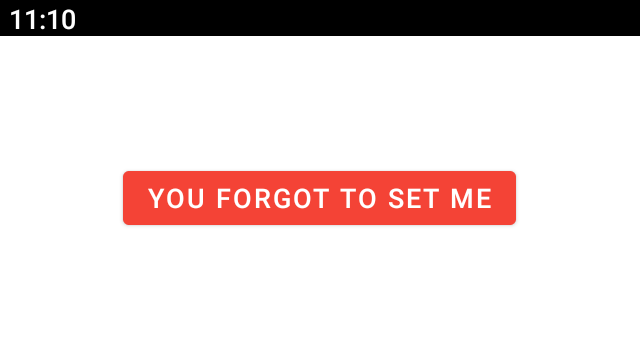
The last place we can set a view attribute is in the theme itself.
<style name="Theme.Demo">
    <item name="android:text">you forgot to set me</item>
</style>
<Button
    android:layout_width="wrap_content"
    android:layout_height="wrap_content"
    android:layout_gravity="center" />
The default text for every view (that supports it) will be “you forgot to set me”:
Let’s create a custom view for our app: a SpottyFrameLayout which draws colored spots over its children.

First, let’s specify a couple of custom attributes in res/main/values/attrs.xml:
<resources>
    <declare-styleable name="SpottyFrameLayout">
        <attr name="spotColor" format="color" />
        <attr name="spotSize" format="dimension" />
    </declare-styleable>
</resources>
We declare each of them with a name and type, inside of the SpottyFrameLayout declare-styleable.
Here’s the code for the SpottyFrameLayout:
class SpottyFrameLayout(context: Context, attrs: AttributeSet) : FrameLayout(context, attrs) {

//    @Px
//    private val spotSize: Float
//    private val spotPaint = Paint().apply { isAntiAlias = true }

    init {
        val typedArray = context.obtainStyledAttributes(attrs, R.styleable.SpottyFrameLayout)
        spotSize = typedArray.getDimension(R.styleable.SpottyFrameLayout_spotSize, 0f)
        spotPaint.color = typedArray.getColor(R.styleable.SpottyFrameLayout_spotColor, 0)
        typedArray.recycle()

//        setWillNotDraw(false)
//    }
//
//    override fun draw(canvas: Canvas) {
//        super.draw(canvas)
//        val spotRadius = (spotSize / 2)
//        val maxSpotsHorizontal = (width / spotSize).toInt()
//        val maxSpotsVertical = (height / spotSize).toInt()
//        for (i in 0 until maxSpotsHorizontal) {
//            for (j in 0 until maxSpotsVertical) {
//                if (Math.random() > 0.95) {
//                    val adjustedRadiusElseItIsBoring = spotRadius - (Math.random() * spotRadius).toFloat()
//                    canvas.drawCircle(spotRadius + i * spotSize, spotRadius + j * spotSize, adjustedRadiusElseItIsBoring, spotPaint)
//                }
//            }
//        }
//    }
}
and our layout:
<com.example.SpottyFrameLayout
    android:layout_width="match_parent"
    android:layout_height="match_parent"
    app:spotColor="@color/material_blue_900"
    app:spotSize="16dp">

    <Button
        android:layout_width="wrap_content"
        android:layout_height="wrap_content"
        android:layout_gravity="center"
        android:text="Hello Android!" />

</com.example.SpottyFrameLayout>
Although we could read values directly from the AttributeSet parameter, it’s better to obtain a TypedArray using Resources.obtainStyledAttributes(...).
val typedArray = context.obtainStyledAttributes(attrs, R.styleable.SpottyFrameLayout)
The TypedArray only contains attributes specified in the styleable so we can use the styleable resources to query it, and it automatically takes care of resource resolution.
spotPaint.color = typedArray.getColor(R.styleable.SpottyFrameLayout_spotColor, 0)
typedArray.getColor(...) will return a color integer whether the value is a hexcode or a color resource, compared to AttributeSet which would give us a string. There’s similar functions for other resource types.
Finally, and most importantly, Resources.obtainStyledAttributes(...) will determine the final value for a particular attribute.
What if android:textColor was specified everywhere? On the view, in the style that’s set on the view, in the default style resource for that view and in the theme?
Resources.obtainStyledAttributes(...) will look for the first occurrence of each specified attribute, in this order:
AttributeSetAttributeSet (named “style”)defStyleAttr and defStyleResLet’s use this information to provide some default styling for SpottyFrameLayout.
We started with app:spotColor and app:spotSize defined in the layout:
<com.example.SpottyFrameLayout
    android:layout_width="match_parent"
    android:layout_height="match_parent"
    app:spotColor="@color/material_blue_900"
    app:spotSize="16dp">

    <Button
        android:layout_width="wrap_content"
        android:layout_height="wrap_content"
        android:layout_gravity="center"
        android:text="Hello Android!" />

</com.example.SpottyFrameLayout>
Let’s extract these to a style:
<style name="Widget.Demo.SpottyFrameLayout" parent="">
    <item name="spotColor">@color/material_blue_900</item>
    <item name="spotSize">16dp</item>
</style>
<com.example.SpottyFrameLayout
    style="@style/Widget.Demo.SpottyFrameLayout"
    android:layout_width="match_parent"
    android:layout_height="match_parent">
    ...
We’re in a better position now. Instead of having to copy two attributes every time we use this widget, we just apply the style. The benefit is that we can update the style in one place, and it’ll change every SpottyFrameLayout that uses it.
We can do better though. Why should we have to specify the style every time? Let’s define a defStyleRes:
private const val DEF_STYLE_RES = R.style.Widget_Demo_SpottyFrameLayout
class SpottyFrameLayout(context: Context, attrs: AttributeSet)
    : FrameLayout(context, attrs, 0, DEF_STYLE_RES) {

    init {
        val typedArray = context.obtainStyledAttributes(attrs, R.styleable.SpottyFrameLayout, 0, DEF_STYLE_RES)
        ...
If we didn’t pass DEF_STYLE_RES to the super constructor too, attributes like android:background wouldn’t work because it’s not part of the SpottyFrameLayout styleable and it wouldn’t have been available to the FrameLayout.
Now we don’t need to include the style every time we use SpottyFrameLayout:
<com.example.SpottyFrameLayout
    android:layout_width="match_parent"
    android:layout_height="match_parent">
    ...
We could have done this another way. Instead of specifying defStyleRes, we could have specified defStyleAttr:
<resources>
    <attr name="spottyFrameLayoutStyle" format="reference" />
    ...
</resources>
private const val DEF_STYLE_ATTR = R.attr.spottyFrameLayoutStyle
class SpottyFrameLayout(context: Context, attrs: AttributeSet)
    : FrameLayout(context, attrs, DEF_STYLE_ATTR) {

    init {
        val typedArray = context.obtainStyledAttributes(attrs, R.styleable.SpottyFrameLayout, DEF_STYLE_ATTR, 0)
        ...
and then specified the style in our app’s theme:
<style name="Theme.Demo">
    ...
    <item name="spottyFrameLayoutStyle">@style/Widget.Demo.SpottyFrameLayout</item>
</style>
It makes sense to start with supporting only defStyleRes since it’s simpler. If we have multiple themes in our app, and the custom view needs to be styled differently in each, then adding defStyleAttr makes sense.
If the view is going to be packaged in a library, then we should do both; we can’t control whether someone else will set the default style in their theme so we should include defStyleRes but at the same time, we want to afford them an easy way to change this default style if they need:
private const val DEF_STYLE_ATTR = R.attr.spottyFrameLayoutStyle
private const val DEF_STYLE_RES = R.style.Widget_Demo_SpottyFrameLayout
class SpottyFrameLayout(context: Context, attrs: AttributeSet)
    : FrameLayout(context, attrs, DEF_STYLE_ATTR, DEF_STYLE_RES) {

    init {
        val typedArray = context.obtainStyledAttributes(attrs, R.styleable.SpottyFrameLayout, DEF_STYLE_ATTR, DEF_STYLE_RES)
        ...
There’s two important takeaways from this post:
Now that we understand default style resources better, let’s revisit materialThemeOverlay from an earlier post in this series to take a deeper look at why it was necessary to add explicit support for this attribute in our custom views, and why it’s not possible for the layout inflater to handle it on our behalf.
Please let me know if you found this post helpful, or if you have any comments or questions (or corrections!).
Thanks Chris for the review.