07 May 2020

This is part two of a series on refactoring themes and styles — it’ll make sense without reading part one, but if you want the full picture, check it out here.
In the last post, we recounted what the theme structure looked like for the Monzo Android app. There were multiple hierarchies, with distinct framework bases, and the sheer number of nodes was pretty overwhelming.
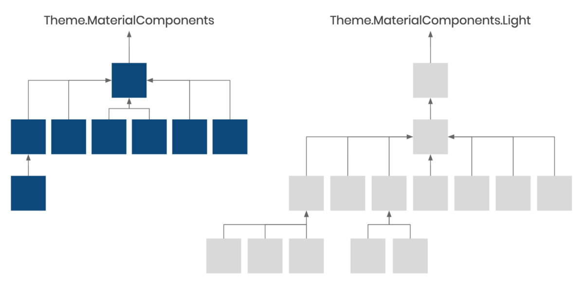
We managed to restructure though. We started by renaming themes and adopting a naming convention to make it easier to understand the state of the app, and followed up by collapsing similar themes into one, ending up with something like this:
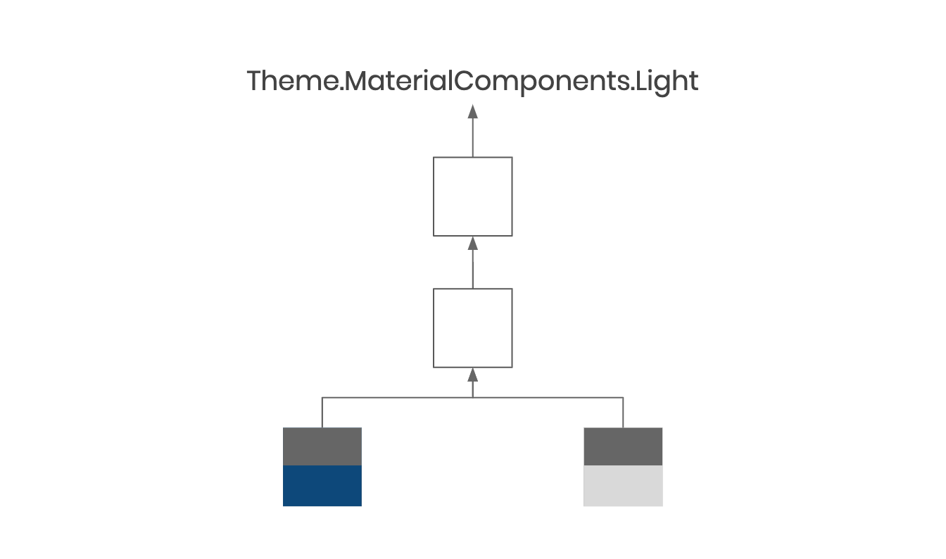
We had a single tree (a single base), meaning we were in a position to move resources from the app themes (the bottom layer) to the base theme (the middle layer). This lets us reduce duplication, making our themes leaner and more robust.
In this post, we’ll briefly cover what default styles are, how to use them, and why they belong (for the most part) in your base theme.
Default styles are what allow us to write <Button> in an XML layout and have it look like a button, rather than a textview. We don’t have to explicitly apply a button style in the layout because the Button class supports default styles, and the default style for button is already set in our theme (in the framework layer, unless you’ve overridden it).
Mostly, this is helpful for consistency within the app and future-proofing design changes. Doing nothing (relying on the default style) is easier than remembering to apply a style, and we’re able to make app-wide changes because the style is defined in one place.
For a quick dive into default styles, check out this video:
or to learn more about how default styles work when it comes to resolving view attributes, take a look at this post.
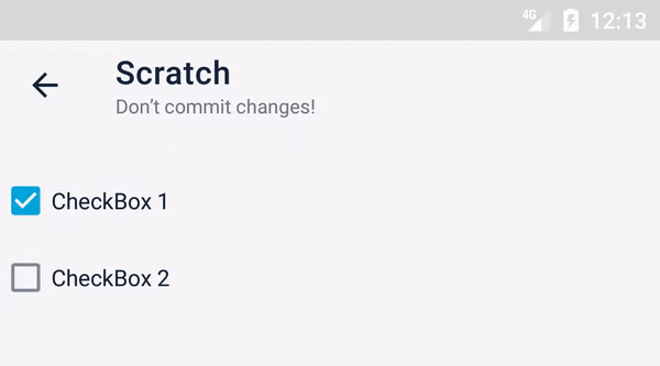
The MaterialCheckBox text color comes from a style called Widget.CompoundButton where it’s set to a theme attribute called textColorPrimaryDisabledOnly.
We don’t set this in our app themes so this is resolved from Theme.MaterialComponents.Light (our framework theme) as black, which is readable in our light theme, but not our navy one, and it’s not acceptable in either. Instead of setting this arcane attribute in our themes, we decided to override the default style for checkboxes.
<?xml version="1.0" encoding="utf-8"?>
<resources>

    <style name="Base.Theme.Monzo" parent="Platform.Theme.Monzo">
        <item name="checkboxStyle">@style/Widget.Monzo.CompoundButton.CheckBox</item>
        <!-- ... -->
    </style>

</resources>
Our style resource looked like this:
<?xml version="1.0" encoding="utf-8"?>
<resources>

    <style name="Widget.Monzo.CompoundButton.CheckBox" parent="Widget.MaterialComponents.CompoundButton.CheckBox">
        <item name="android:textColor">?attr/mdsColorContentPrimary</item>
        <item name="materialThemeOverlay">@style/ThemeOverlay.Monzo.CompoundButton.CheckBox</item>
    </style>

    <style name="ThemeOverlay.Monzo.CompoundButton.CheckBox" parent="">
        <item name="colorSecondary">?attr/mdsColorPrimary</item>
        <item name="colorControlHighlight">@color/mds_content_primary_12</item>
    </style>

</resources>
Some points to call out:
We fixed the text color by setting that view property (android:textColor) here, explicitly.
MaterialCheckBox uses a few theme attributes (colorSecondary and colorControlHighlight) to tint the background of the widget in certain states. We override these explicitly for all checkboxes by using materialThemeOverlay (we’ll cover theme overlays and how we use them at Monzo in the next post).
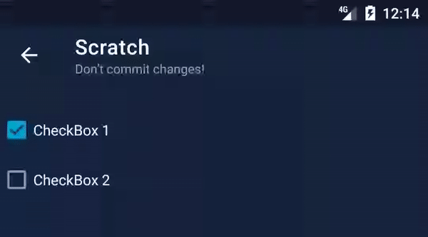
Here’s the result!
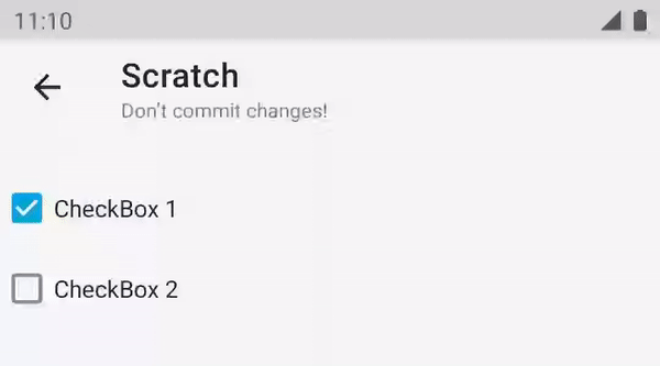
We can see that colorSecondary is used for the ripple when the checked state is true, but otherwise colorControlHighlight is used. Annoyingly, the alpha component is automatically applied for the checked state, but not the other—this means we have to handle it ourselves, which we did using a ColorStateList with only one state:
<?xml version="1.0" encoding="utf-8"?>
<!-- res/color/mds_content_primary_12.xml -->
<selector xmlns:android="http://schemas.android.com/apk/res/android">
    <item android:alpha="0.12" android:color="?attr/mdsColorContentPrimary" />
</selector>
This handy trick allows us to apply alpha to theme attributes, so we can use this color resource in our base theme, and it’ll work with all of our app themes. This keeps our app themes very minimal — they’re essentially a collection of color definitions.
If your minSdkVersion is 23 or higher, that’s it! You can stop reading.
Ah ok, then we’d better test this on Lollipop too.
| Light | Dark |
|---|---|
 |
 |
The ripples are red. This happens because Android didn’t support theme attributes in ColorStateList resources natively until API 23.
If this was our custom view, we could load the resource with AppCompatResources.getColorStateList, and tint the background programmatically, but it’s not — it’s a framework widget. So what options do we have?
We’ll do the last one. First, we need to add different variants for the checkbox style that work with each of our app themes:
<!-- widgets.xml -->
<style name="Widget.Monzo.CompoundButton.CheckBox" parent="Widget.MaterialComponents.CompoundButton.CheckBox">
    <item name="android:textColor">?attr/mdsColorContentPrimary</item>
    <item name="materialThemeOverlay">@style/ThemeOverlay.Monzo.CompoundButton.CheckBox</item>
</style>

<style name="ThemeOverlay.Monzo.CompoundButton.CheckBox" parent="">
    <item name="colorSecondary">?attr/mdsColorPrimary</item>
    <item name="colorControlHighlight">@color/mds_content_primary_12</item>
</style>

<style name="Widget.Monzo.CompoundButton.CheckBox.OnLight">
    <item name="materialThemeOverlay">@style/ThemeOverlay.Monzo.CompoundButton.CheckBox.OnLight</item>
</style>

<style name="ThemeOverlay.Monzo.CompoundButton.CheckBox.OnLight">
    <item name="colorControlHighlight">@color/navy_12</item>
</style>

<style name="Widget.Monzo.CompoundButton.CheckBox.OnDark">
    <item name="materialThemeOverlay">@style/ThemeOverlay.Monzo.CompoundButton.CheckBox.OnDark</item>
</style>

<style name="ThemeOverlay.Monzo.CompoundButton.CheckBox.OnDark">
    <item name="colorControlHighlight">@color/white_12</item>
</style>
We added styles which reference alternative resources, @color/white_12 and @color/navy_12, which don’t contain theme attributes.
In res/values-v23/widgets.xml, we override these styles so that they don’t contain anything — they’ll inherit everything from the original style, since that works on API 23 and above:
<?xml version="1.0" encoding="utf-8"?>
<!-- res/values-v23/widgets.xml -->
<resources>

    <style name="Widget.Monzo.CompoundButton.CheckBox.OnLight" />
    <style name="Widget.Monzo.CompoundButton.CheckBox.OnDark" />

</resources>
When we increase our minSdkVersion to 23, we’ll be able to delete the specialized versions, and revert to using the original one in our base theme.
And finally, instead of specifying our lovely theme-agnostic style in the base layer, we’ll use the specialized variants in each app theme:
<style name="Theme.Monzo.Light" parent="Base.Theme.Monzo">
    <item name="checkboxStyle">@style/Widget.Monzo.CompoundButton.CheckBox.OnLight</item>
    <!-- ... -->
</style>

<style name="Theme.Monzo.Dark" parent="Base.Theme.Monzo">
    <item name="checkboxStyle">@style/Widget.Monzo.CompoundButton.CheckBox.OnDark</item>
    <!-- ... -->
</style>
| Light | Dark |
|---|---|
 |
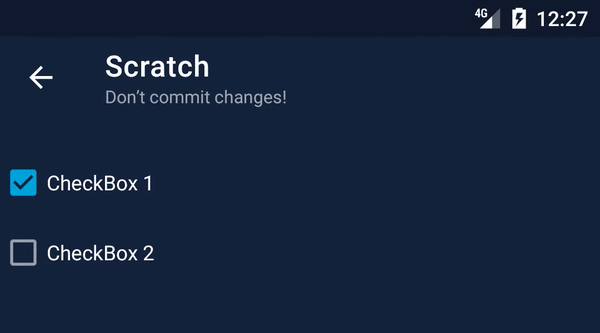 |
Default styles help us remove unnecessary configuration, by moving style declarations to our theme.
Ideally, we’d be able to specify them in our base theme to keep our app themes as small as possible, but even when we can’t, we can leverage the style system to minimise duplication by overriding only the properties we need.
In the next post in this series around refactoring themes, we’ll look at theme overlays, how they work, and why Monzo uses them.
I wrote part 2 of Refactoring Themes with Style. This highlights how we used default styles on Android, and how we worked around an issue on Lollipop.https://t.co/c6OqKD0nif
— ataúl ✏️ (@ataulm) May 7, 2020
Thanks @pauldavies83 & @ricknout for the 👀! #androiddev #gde