20 November 2019
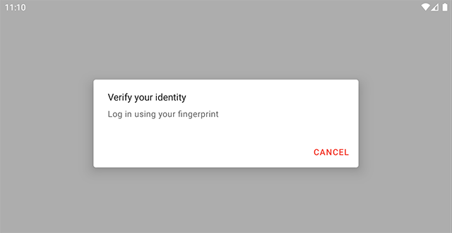
A ContextThemeWrapper allows us to modify or overlay the theme of another context. Let’s have a look at how we’d do this, using an alert dialog as an example.
Material Components for Android doesn’t include an alert dialog implementation. Instead, MaterialAlertDialogBuilder is used to apply Material theming (color, typography and shape) to the AppCompat implementation.
MaterialAlertDialogBuilder(context)
       .setTitle("Verify your identity")
       .setMessage("Log in using your fingerprint")
       // ...
       .create()
The builder will use the theme of the context given to the builder to theme the dialog (in our theme, we’ve set colorPrimary to red):
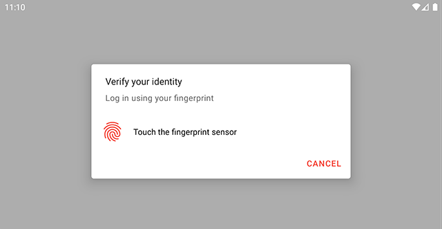
The builder lets us provide a custom view as a component in the dialog.
<LinearLayout
   android:layout_width="match_parent"
   android:layout_height="match_parent">

   <ImageView
       android:id="@+id/fingerprintAuthIcon"
       android:layout_width="40dp"
       android:layout_height="40dp"
       app:srcCompat="@drawable/ic_baseline_fingerprint_24"
       app:tint="?attr/colorPrimary" />

   <TextView
       android:id="@+id/fingerprintAuthStateText"
       android:layout_width="match_parent"
       android:layout_height="wrap_content"
       android:text="Touch the fingerprint sensor"
       android:textColor="?attr/colorOnSurface" />

</LinearLayout>
val customView = LayoutInflater.from(context).inflate(R.layout.dialog_custom_view, ...)

MaterialAlertDialogBuilder(context)
       .setTitle("Verify your identity")
       .setMessage("Log in using your fingerprint")
       // ...
       .setView(customView)
       .create()
Since we referenced a theme attribute for the icon tint (colorPrimary), this appears red too:
Let’s change the primary color for alert dialogs to use blue instead of red, being careful not to affect the rest of our app. We can achieve this using theme overlays in two ways.
In our app’s theme, we can set materialAlertDialogTheme to a theme overlay:
<style name="Theme.Demo" parent="Base.Theme.Demo">
   ...
   <item name="materialAlertDialogTheme">@style/ThemeOverlay.Demo.Dialog</item>
</style>

<style name="ThemeOverlay.Demo.Dialog" parent="ThemeOverlay.MaterialComponents.MaterialAlertDialog">
   <item name="colorPrimary">@color/material_blue_900</item>
</style>
This is similar to setting a default style for a widget, this theme overlay will be used for every Material alert dialog (unless otherwise overridden).
The other way we can do this is by passing a theme resource ID directly to the builder. This is useful if we want to modify a dialog’s theme on a case-by-case basis.
MaterialAlertDialogBuilder(context, R.style.ThemeOverlay_Demo_Dialog)
Whichever approach we take, this is what we end up with:
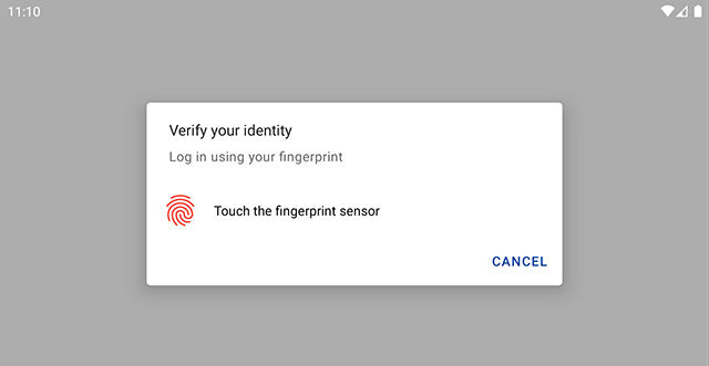
Wait, why is our icon still red?
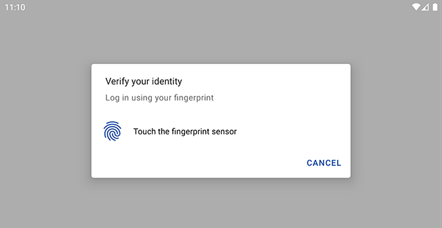
Our custom view is still being inflated with a context that has colorPrimary set to red. This is where we could use a ContextThemeWrapper.
val dialogThemeContext = ContextThemeWrapper(context, R.style.ThemeOverlay_Demo_Dialog)
val customView = LayoutInflater.from(dialogThemeContext).inflate(R.layout.dialog_custom_view, ...)
Now, our custom view will be inflated with a context where colorPrimary resolves to blue:
Using the theme resource ID directly works, but then we need to keep this in sync with the theme used by the dialog. We could instead query the value of materialAlertDialogTheme from our theme:
   ...
   val dialogTheme = context.resolveThemeAttr(R.attr.materialAlertDialogTheme)
   val dialogThemeContext = ContextThemeWrapper(context, dialogTheme)
}

private fun Context.resolveThemeAttr(@AttrRes attr: Int) = TypedValue().let { typedValue ->
   theme.resolveAttribute(attr, typedValue, true)
   typedValue.resourceId
}
This means that whenever the value for materialAlertDialogTheme changes, the layout inflater will always use a ContextThemeWrapper with a matching theme.
Currently the materialAlertDialogTheme hasn’t been made explicitly public, meaning that Lint will flag usages in code. I’ve opened an issue for this here.
Cool! So we’ve seen we can use a ContextThemeWrapper ourselves to overlay a theme programmatically for custom views in our dialog. But there’s other ways too.
In this example, we could have achieved the same effect by specifying the android:theme attribute in the layout for our custom view:
<LinearLayout
   android:layout_width="match_parent"
   android:layout_height="match_parent"
   android:theme="?attr/materialAlertDialogTheme">

   ...
This works on Android 5 and above (or earlier if we’re using an AppCompat or MaterialComponents theme). The layout inflater will read the value of android:theme and use a ContextThemeWrapper in the same way we’ve done above.
The initial problem was that we were using the wrong context—we ought to use the one closest to the view we’re styling. Instead of using the ContextThemeWrapper ourselves, or specifying the theme overlay with android:theme in the layout, we could have used the context from the builder:
val builder = MaterialAlertDialogBuilder(context)
val dialogThemeContext = builder.getContext()
val customView = LayoutInflater.from(dialogThemeContext)
       .inflate(R.layout.dialog_custom_view, ...)

builder.setTitle("Verify your identity")
       .setMessage("Log in using your fingerprint")
       // ...
       .setView(customView)
       .create()
Thanks Christophe for this hint!
Under the hood, MaterialAlertDialogBuilder is using ContextThemeWrapper in exactly the same way; it resolves materialAlertDialogTheme, using the value as a theme overlay.
There are a couple of cases where ContextThemeWrapper is exclusively helpful. For example, with data binding, since android:theme can’t be used or in the case of materialThemeOverlay, being able to add support for theme overlays in default style resources without breaking support for android:theme.
In our next post, we’ll look at how android:theme was backported in more detail. As always, let me know if you have any comments, questions or corrections.
Thanks Nick for the review.