30 April 2019
We’ve been working recently on Monzo Plus, a way for users to add extra features (like travel insurance) to their account for a monthly fee.
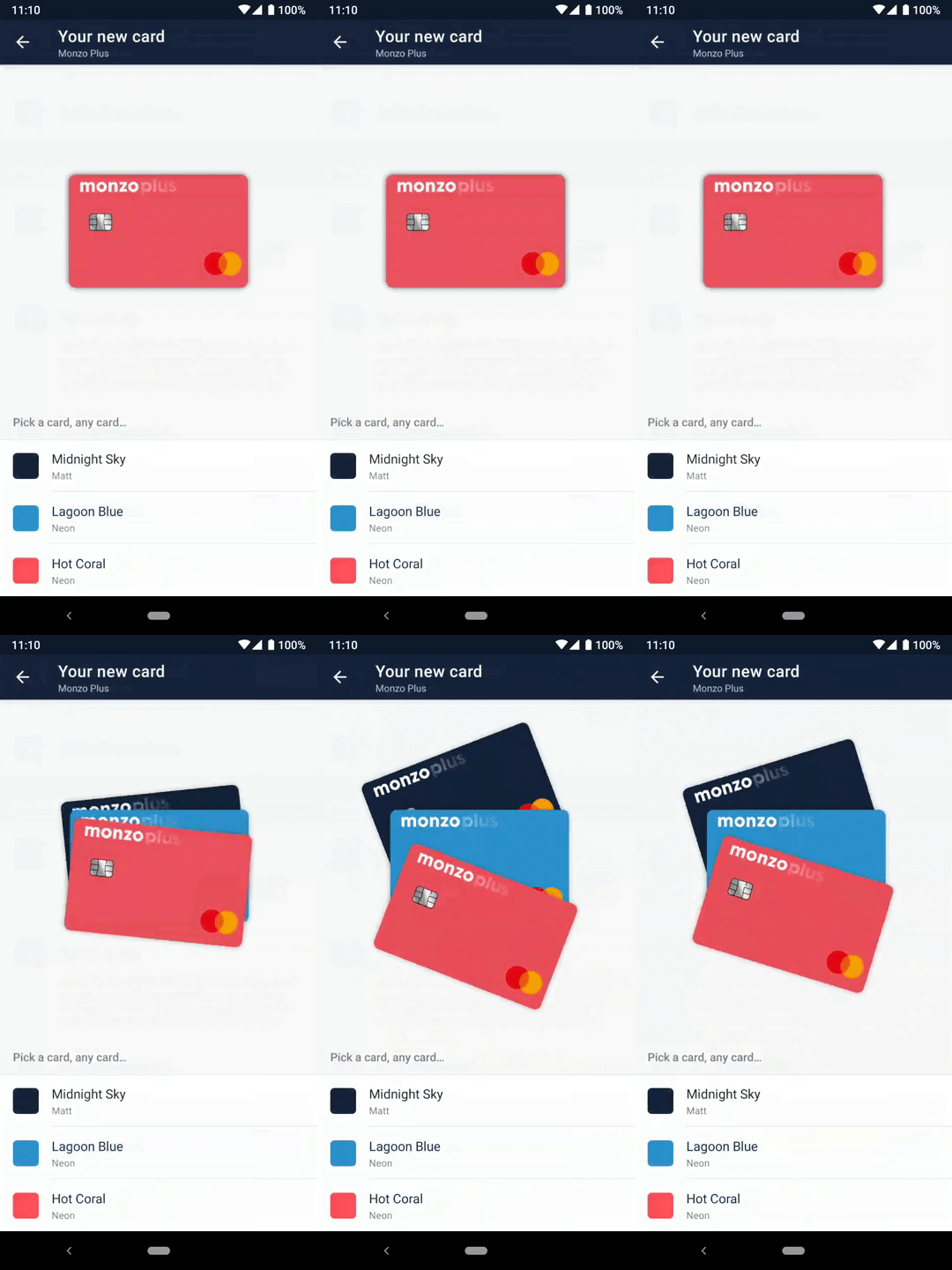
As part of this package, users are able to choose one of three card colours—the iconic Hot Coral, the also-neon Lagoon Blue or, what seems to be an early fan favourite, Midnight Sky.
This post shows how we implemented the animations on Android.
| On load | On select |
|---|---|
 |
 |
There’s three distinct parts:
All three parts were encapsulated in a class called ShufflingCardsView which began as a thoroughly unexciting CardsImagesView with the following API:
fun setCards(cardDesigns: List<CardDesign>)fun moveToFront(cardDesign: CardDesign)While we were working on the sign up flow, we just used ImageView.setImageResource(...) to unceremoniously switch between the selected card. The simple API meant that when we had time, we were able to implement the animations without touching any other part of the codebase.
The design consideration behind the fan out animation was to “reveal” the new colours as a surprise. Kind of like how a magician would ask someone to pick a card for a trick — it’s magical.
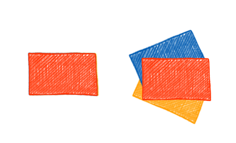
The fan out consists of three animations:
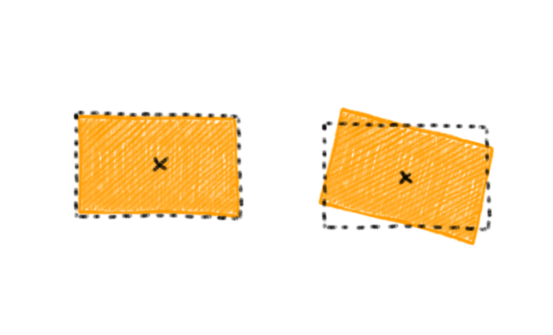
-17°-12dp on the x-axis and -60dp on the y-axisWe used ViewPropertyAnimator because the API is convenient and we wanted to animate several properties at the same time:
blueCardView.animate()
        .rotation(-17f)
        .translationXBy(-12.dp.toFloat())
        .translationYBy(-60.dp.toFloat())
        .setDuration(600)
        .setStartDelay(1000)
        .setInterpolator(OvershootInterpolator(3f))
        .start()
When the user selects a card initially, we want to collate the cards again, but not in a neat stack.
To do this, we could have rotated the views directly, again using the centre of the view as the pivot. However, for next animation, we need the pivot to be in the bottom right corner — the ViewPropertyAnimator wouldn’t let us perform two rotations on the same view simultaneously with two different pivot points.
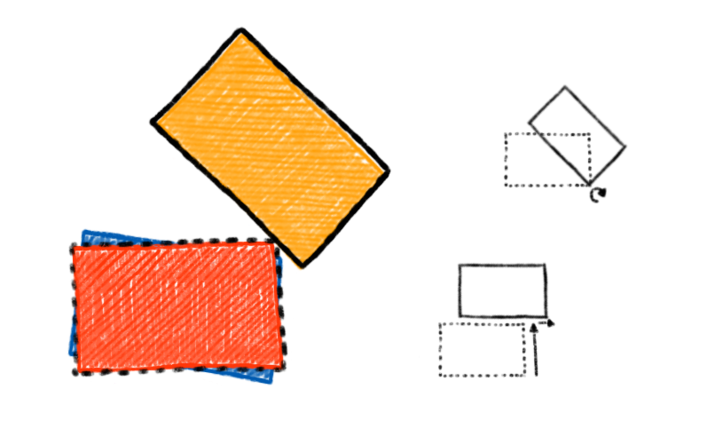
Instead, we represented each card as a FrameLayout with a child ImageView. For the “messy” angles, we would animate the rotation on the child ImageView, but the outer FrameLayout would stay as is.
For this, we had to turn off child clipping in the ShufflingCardsView so that each card’s outer FrameLayout would be able to draw its child ImageView beyond its bounds.
The last part was the card select animation. An early version was more fancy—depending on which card you selecting, either the front card would be shuffled to the back, or the back card would be shuffled to the front.
Later, we simplified it such that the selected card would always be the one that was yanked out and placed in front. This is because we wanted to support an indeterminate number of cards so that we could reuse ShufflingCardsView in other parts of the app where there might be a smaller or greater (…) number of cards.
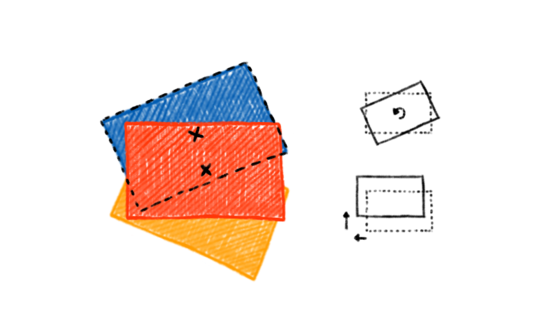
Here:
45°45dp on the x-axis and -200dp on the y-axis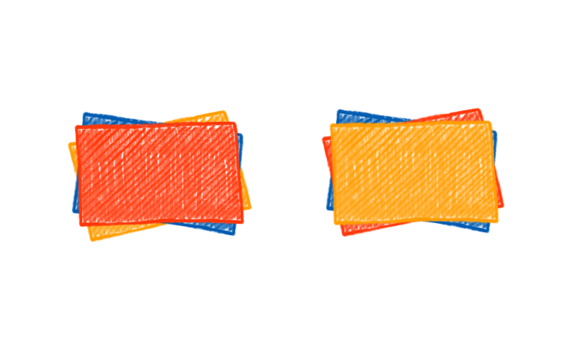
At the peak of the animation, we need to update the z-index of all the cards, so that when it comes back down, the selected card is at the front.
We used withEndAction to chain animations for this — it’s such a short animation (and quick too) that there’s no need to be really exact with the synchronizations.
I’d like to add a little wiggle if the user re-selects the currently selected card. I think also it could be a bit more flexible with sizes (e.g. using ConstraintLayout and aspect ratio) rather than the hardcoded dps.
I had a quick go at using ObjectAnimator so that I could use AnimatorSet to synchronise the animations more explicitly, but I couldn’t get the z-index ordering to work nicely in the case of the user spamming the card selections; using ViewPropertyAnimator in contrast seemed to handle spammy-clicks very gracefully.
A more or less up to date version of the ShufflingCardView can be found here.
How would you implement this? Could you do it with MotionLayout or a custom RecyclerView.LayoutManager? Let me know on Twitter.