22 April 2018
The past two years have seen a lot more interest for inclusive design in the Android community. There’s been a lot of content (blogs and talks) introducing waves of designers and developers to accessibility.
Some of these people have since taken up an “accessibility mantle”, championing inclusive design within their teams and companies.
But while it’s useful to have an enthusiastic supporter or expert around, having only one person carrying the torch isn’t sustainable for a product — you need the whole team!

Maybe the reason for this poor uptake is because we moved too quickly, or focused on the wrong parts.
A lot of the talks and blog posts dish out great tips and best practices, but they can be overwhelming.
It means that people can come away from the experience feeling that accessibility is a “Good Thing To Do”, but find it difficult to start. This is especially hard if there is no context or framework in which to make changes.
On Twitter I asked, what did people need?
imagine you're in a position (💵 and ⌚️) to make your app accessible (vague word is vague).
— ataúl ✏️ (@ataulm) February 25, 2018
what's stopping you?
would you prefer examples from scratch, base concepts, migration techniques, etc? Something else? RTs and replies appreciated 🙌#androiddev
The responses (public and private) were varied. I had questions such as “how can we integrate accessibility checks into our build process?” or “how should we change the UX to adapt for different users?”.
The majority of the responses, however, were about getting started!
There were also questions from the business side:
Let’s re-frame the context of what it means to make an app accessible. There are two things that every app does:
Our job, as developers and designers, is to facilitate these two things for as many users as possible — and that’s all accessibility is.
Let’s use YouTube as a non-trivial case study. It works because it includes a lot of the widgets and design-patterns we encounter day-to-day, as well as other components (like video) that we might not have experience using in our apps.

We’ll highlight the things it does well, and also look at opportunities where we can approach things differently.
A lot of the following content might seem simple in theory, but that’s good. The idea is to fill gaps not only in our understanding but also our designs and implementations. When you’ve tackled the issues presented here, it’s your turn to say, “what’s next?”
We’ll cover two topics in this article, but for me, addressing these issues will make the biggest difference for your users.
There’s only one thing that text needs to be — readable. This section will focus on how to prioritize the readability of your text, i.e. make it accessible to your users.
One of the hardest things we have to do is design for non-static content. For most of us, the content we display to the user is delivered to us from a remote server.
Even for text that we know at design time, we don’t know how translations will affect the length. To keep our text readable, we need to make sure it’s never cut off.

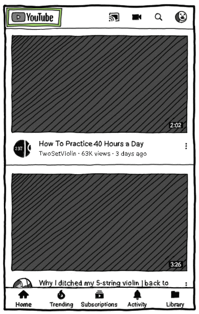
YouTube displays information about videos sourced entirely from uploaders. It uses several techniques to handle dynamic content!
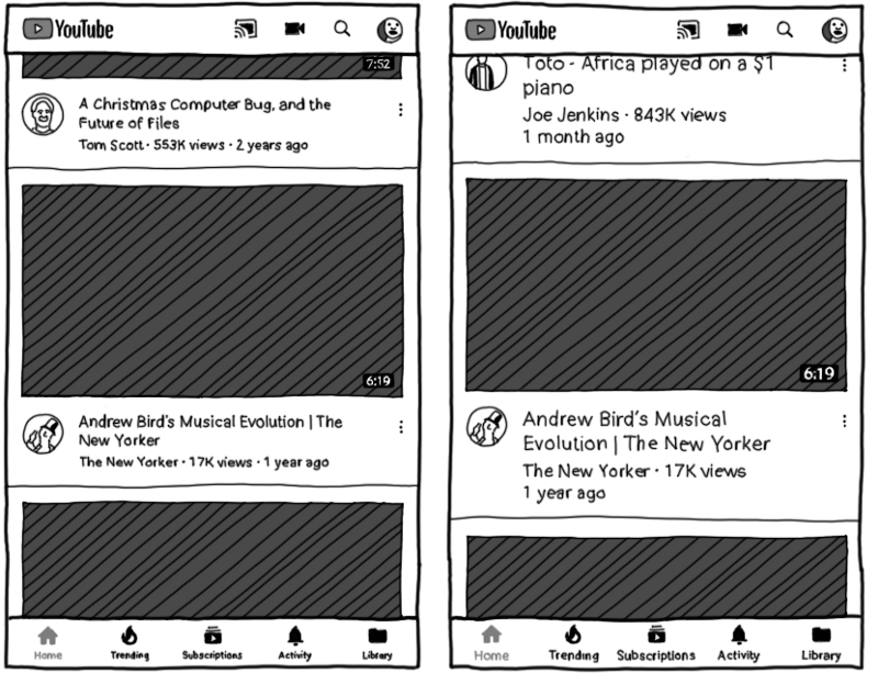
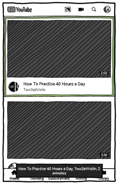
Create fully responsive layouts wherever possible. On the YouTube homepage, each item’s width matches the device width, but the height is unconstrained.
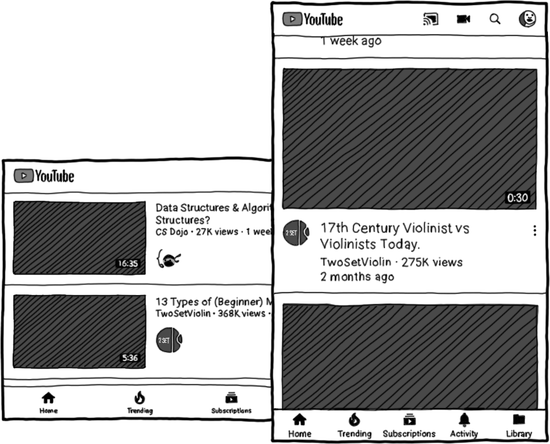
Because the list is vertically scrollable, items can grow (vertically) without restriction. Video titles can be as long or short as they like, with text wrapping onto new lines.
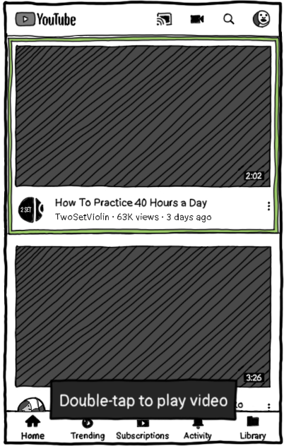
Double-check views that have a fixed-size. On the video page, there’s a scrollable list of related content. Here, a fixed height means more items can fit on screen.
But look, one of the titles is no longer fully readable!
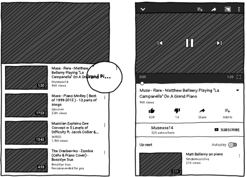
It’s OK! Ellipses can serve as a subtle call-to-action. Here, they let the user know that clicking on the item will take them somewhere they can read the video title in its entirety.
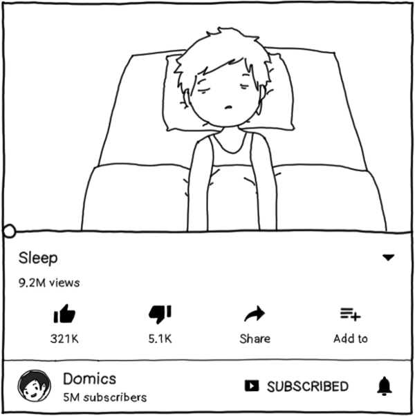
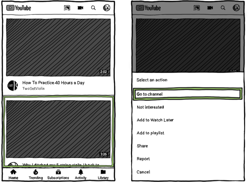
Split content into multiple parts. Users can write very long descriptions for videos. By default, the app only shows the title, and some stats. Clicking on the title or the arrow will expand the view to show the description and some of the stats in more detail:
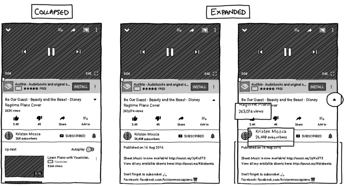
Some of the channels are really popular, with millions of subscribers. In the expanded form, this means that the text might not fit:
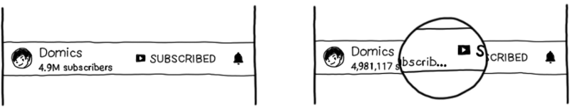
In this case, we could choose to wrap the text onto a new line, increasing the height of the container, instead of ellipsizing the label.
So now we’ve handled the cases where text might be cut off. Great! What else do we have to do in our effort to keep text readable?
Test your app at various font scales. The user can change the font scale at the system level and our apps should support this by using scaleable pixels to specify text size. Anything that used “sp” units to define size will scale relatively:
If you have text in your images, then those images should scale as well (or avoid putting text in images!). Consider using scaleable pixels to define dimensions for icons too. What do you think the effects would be?
Users aren’t able to choose arbitrary values for the text size. They must select from “small”, “normal”, “large” and “huge”, which ranges from 0.8–1.3x the normal size. This means you can limit your testing to these extreme values.
Novoda has a JUnit test rule that can help you set the font scale on devices during your Espresso test runs, and reset them afterwards. The system font scale will be set to huge before VideoActivity is launched:
// FontScaleRules available from "novoda/espresso-support"
class VideoActivityTest {

    val activityRule = ActivityTestRule(VideoActivity::class.java)

    @Rule
    val ruleChain = RuleChain.outerRule(FontScaleRules.hugeFontScaleTestRule())
            .around(activityRule)
}
After the test runs, VideoActivity will be torn down and then the font scale will be reset to its original value, ready for the next test.
The final part to making your text readable is being color considerate. There’s two requirements to this:
The bottom navigation bar in YouTube, for instance, indicates the selected page by coloring it red. Let’s compare what it looks like for users with a specific type of color blindness called protanopia:

Even something subtle, like changing the font weight can be useful as a secondary information vector.
For users with protanopia, the active icon would still be distinct from the others:

Test your color palettes — there are handy apps you can use on your computer for this (Sim Daltonism for OSX), and you can even test directly on your device with the Simulate Color Space feature under Developer Options.
Color contrast is the “difference” between two colors. For us, we usually mean the color of text and the color of its background, but it can also apply to iconography.
Although the idea is simple, it’s not always straightforward because the colors may be generated at runtime with utilities like Palette or the background may be an image or video.
| Playing video | with video overlay |
|---|---|
 |
 |
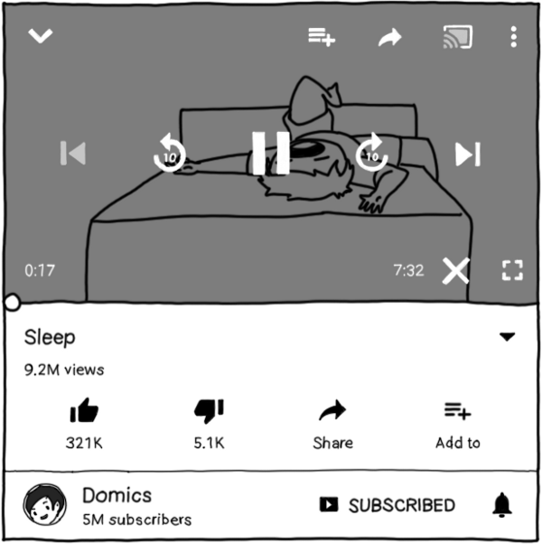
YouTube uses a darkened background when displaying controls on top of a video. This means that the white text is always readable and white icons are always distinguishable, regardless of the video color.
A structured guide to accessibility on Android would be incomplete without mentioning accessibility services!
An accessibility service is a software-based assistive technology — it helps the user interact with their device, and it still does the two things we mentioned at the start:
However, by putting a little effort in, we can improve the usability of our apps for users of these services.

Google TalkBack is probably the most well known accessibility service. It’s used by blind people or users with severe visual impairments.
TalkBack acts as a screenreader and, via gestures, provides users with affordances to navigate between, and interact with, elements on screen.
With TalkBack, users navigate through elements on screen sequentially, using gestures like “swipe right” to go to the next element, or “left” to go to the previous.
Double-tapping anywhere on the screen will send a click event to whatever’s focused.
The usual way to navigate an unfamiliar app is to use these gestures to get through the page one item at a time. However, the user can choose to tap anywhere on the screen to move the focus directly to that view.
This can be useful on screens with long lists — by default, using the “next” gesture will cause the list to scroll, which means it’s easy to get trapped in a long list.
Instead, with the Touch-to-Explore setting, the user can jump to the bottom navigation or the app bar without having to go through every list item.
When I was collecting feedback, someone asked “what makes a good content description?” Since TalkBack is a spoken feedback accessibility service, it reads the content descriptions of views to let the user know what’s on screen.
Some View types have inherent descriptions; anything extending TextView will read the text aloud. For images and other views, you need to set the content description yourself. Say what it is, and where applicable, the state.
<Button
    android:id="@+id/likeButton"
    android:layout_width="wrap_content"
    android:layout_height="wrap_content"
    android:text="Like" />

<ImageView
    android:id="@+id/likeBadge"
    android:src="@drawable/ic_heart_filled"
    android:layout_width="24dp"
    android:layout_height="24dp"
    android:contentDescription="Liked" />
Remember to describe what the image represents, not the image itself. For the app bar, it’s enough to say “YouTube” and “Search” rather than “YouTube logo” and “magnifying glass”, because that better describes the purpose of these images.
Specify explicit content descriptions for ViewGroups too. It’s not just individual Views that need content descriptions. Setting the description on a complex ViewGroup allows you to control what TalkBack is going to say as well as the order.
If you don’t, TalkBack will concatenate the content descriptions of all the children, which can be dangerous as the View changes through app and feature updates.
So we said that a good content description should describe what a View is, not what it does. But then how does the user know whether an element is actionable or not?
Previously, the recommended approach was to append the word “button” to the content description. This lets the user know that the element is clickable.
Instead, add usage hints to actionable views. Usage hints are automatically added to clickable Views — after the content description is read, there’s a brief pause, followed by the hint.
By default, it says “Double tap to activate”. However, from Lollipop and above, we can customize the action. So how do we do that?
AccessibilityDelegates let us override some of the methods in View that relate to accessibility.
We can add additional metadata about the View to AccessibilityNodeInfo objects, as shown below, specifying a custom label for a click action.
ViewCompat.setAccessibilityDelegate(itemView, object: AccessibilityDelegateCompat() {
    override fun onInitializeAccessibilityNodeInfo(host: View, info: AccessibilityNodeInfoCompat) {
        super.onInitializeAccessibilityNodeInfo(host, info)
        val clickActionId = AccessibilityNodeInfoCompat.ACTION_CLICK
        info.addAction(AccessibilityActionCompat(clickActionId, "play video"))
    }
})
If you only need to set a usage hint, you can add a Kotlin extension function to simplify this to one line, writing only:
itemView.setUsageHint("play video")
That’s pretty much it if you want a base level of support for TalkBack: explicitly-set content descriptions and usage hints. But let’s raise the bar.
Linear navigation means going through a feed can be tedious, since TalkBack will focus on all the inline actions as well as the item itself.
What we can do is detect whether an accessibility service like TalkBack is enabled, and provide alternative behavior, like removing any inline actions:
Instead of three clickable areas per item, we have one. This means you only need a single gesture to navigate between elements.
But hang on a minute! We can’t just get rid of actions and reduce functionality under the guise of simplicity!
Instead, when a user clicks on an item, we’ll display all the actions for that video in a dialog.
Doing this across the app wherever we’re looking to simplify ViewGroups will lead to a consistent user experience for TalkBack users.
To expose these actions directly to the accessibility service, we can override two methods from the same AccessibilityDelegate that we used earlier for usage hints:
ViewCompat.setAccessibilityDelegate(itemView, object: AccessibilityDelegateCompat() {
    override fun onInitializeAccessibilityNodeInfo(host: View, info: AccessibilityNodeInfoCompat) {
        super.onInitializeAccessibilityNodeInfo(host, info)
        info.addAction(AccessibilityActionCompat(R.id.play_video, "play video"))
    }

    override fun performAccessibilityAction(host: View?, action: Int, args: Bundle?): Boolean {
        if (action == R.id.play_video) {
            // TODO: take action
            return true;
        }
        return super.performAccessibilityAction(host, action, args)
    }
})
These allow power-users to trigger actions for a given View using other gestures.
To make it easier to implement this and the dialog functionality without duplicating code, you can use accessibilitools.
// github.com/novoda/accessibilitools
val actionsMenuInflater = ActionsMenuInflater.from(getContext())
val listener: MenuItem.OnMenuItemClickListener = // ...
val menu = actionsMenuInflater.inflate(R.menu.actions, listener)

val delegate = ActionsMenuAccessibilityDelegate(menu, listener)
ViewCompat.setAccessibilityDelegate(itemView, delegate)
This library allows you to specify actions as a menu resource and callbacks with a MenuItemClickListener, and provides the custom AccessibilityDelegate you’ll need.
A similar technique can be used for sliding tab strips or bottom navigation, allowing the user to access navigation controls when necessary, but without requiring them to traverse each item individually.
There’s an updated way to do this. See “Exposing hidden actions on Android”.
If an accessibility service is enabled, YouTube doesn’t auto-dismiss the media controls on a video after a few seconds. Instead, it keeps them displayed indefinitely and adds an explicit dismiss button to the overlay.

In addition, since SeekBar controls are fiddly to use with TalkBack, there’s additional rewind and forward buttons available.
If it makes sense, consider adding custom actions that are available for users of accessibility services in place of (or in addition to) other affordances.

At the end of the day, each of the individual considerations aren’t difficult to implement. The difficulty lies in keeping them consistent in your app, between screens and between versions.
For me, the next step is working on how to bake this into a process that spans design, development and QA. I hope these examples help give you actionable stages you can work towards.
If you have any questions, comments or corrections, let me know!
Thanks to Zarah, Maria, Pavlos, Ben and Raúl for feedback on this post!