30 April 2020

Last year, Nick Butcher and Chris Banes presented “Developing Themes with Style” at Droidcon Berlin. It was a welcome recap for themes and styles, as well as best practices for Android theming.
We’ve been working to apply these best practices to the Android app at Monzo. For us, the challenge lay more in how we could make these changes safely, over time. In other words, how we can refactor our themes.
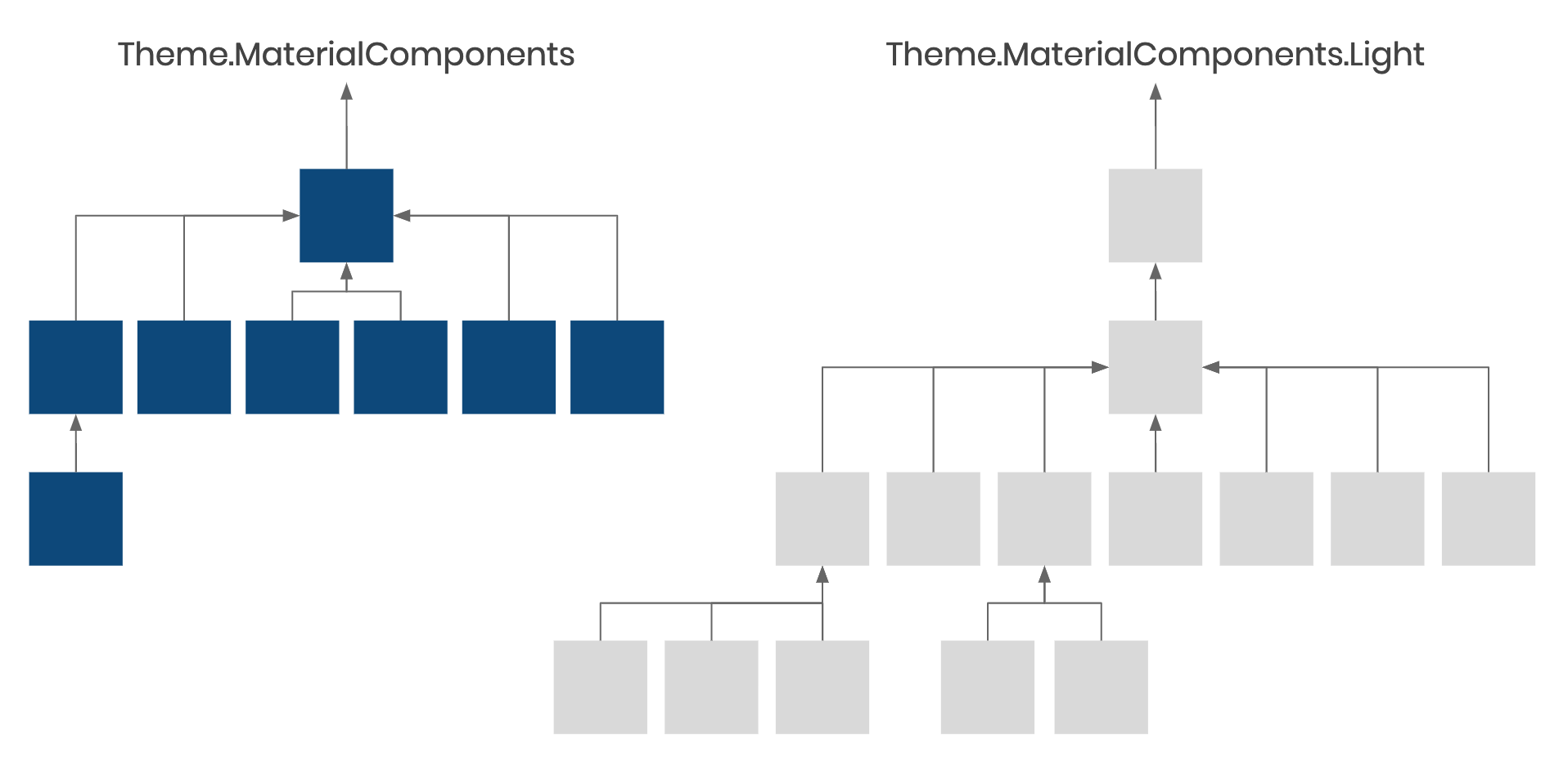
From the outside, the look and feel of the Monzo app is pretty simple. We had a dark theme, a light theme, as well as a light theme with a dark toolbar.

It actually turned out that we had more than three themes - we had 22, and the theme hierarchy looked as follows. Each square represents a theme, where the arrows show how themes inherit from each other, but when we checked the usages, it wasn’t always clear why a screen used a particular variant over another, and some weren’t used at all:
This app is growing fast. At last count, we had around 130 activities and 300 fragments, being developed by 18 Android engineers, spread across multiple teams who ship a new release, every week, so it’s understandable how we got to this position.
The most difficult aspect was that we had two trees. This meant that it was reasonably easy to add a theme-related bug to one tree and not the other, and the same went for bug fixes.
What we wanted was something closer to structure that Nick and Chris presented:
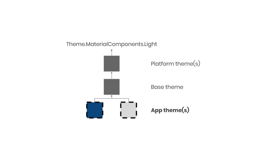
There’s a single tree, with four layers:
Each one has a specific purpose, and understanding these helps us keep our themes tidy and maintainable.
At the very bottom are the app themes, which we apply at the activity level:
Theme.Monzo.LightTheme.Monzo.DarkThe app theme will mostly contain values for colour attributes, like colorPrimary, colorSurface and android:colorBackground. For example, android:colorBackground is defined as navy in Theme.Monzo.Dark but it’s off-white in Theme.Monzo.Light.
<style name="Theme.Monzo.Light" parent="Base.Theme.Monzo">
    <item name="android:colorBackground">@color/off_white</item>
    <item name="colorOnBackground">@color/navy</item>
    <item name="colorSurface">@color/white</item>
    <item name="colorOnSurface">@color/navy</item>
    <item name="colorPrimary">@color/off_white</item>
    <item name="colorOnPrimary">@color/navy</item>
    <!-- ... -->
</style>

<style name="Theme.Monzo.Dark" parent="Base.Theme.Monzo">
    <item name="android:colorBackground">@color/navy</item>
    <item name="colorOnBackground">@color/white</item>
    <item name="colorSurface">@color/dark_grey</item>
    <item name="colorOnSurface">@color/white</item>
    <item name="colorPrimary">@color/navy</item>
    <item name="colorOnPrimary">@color/white</item>
    <!-- ... -->
</style>
When all views and layouts only reference colour attributes from our themes, then adding “night-mode” to the app becomes trivial: we can override these app themes in the values-night resource directory, with a different set of colour values.
Our base theme, Base.Theme.Monzo, is where we override or define default styles for views and text appearance attributes.
This layer generally doesn’t contain references to specific colours. Instead, the style resources used here will references attributes from the app themes.
<style name="Base.Theme.Monzo" parent="Platform.Theme.Monzo">
    <!-- ... -->
    <item name="tabStyle">@style/Widget.Monzo.TabLayoutLegacy</item>
    <item name="textInputStyle">@style/Widget.Monzo.TextInputLayout</item>
    <item name="toolbarStyle">@style/Widget.Monzo.Toolbar</item>
    <!-- ... -->
</style>
Avoiding the use of hardcoded colours in this layer means that everything common to all themes can go here.
The platform theme layer allows us to account for API specific attributes. Using resource qualifiers, we can specify a different platform theme for different versions of Android.
<!-- res/values-v23/themes.xml -->
<?xml version="1.0" encoding="utf-8"?>
<resources>

    <style name="Platform.V23.Theme.Monzo" parent="Platform.V21.Theme.Monzo">
        <!-- Attributes which are only available from API 23 -->
    </style>

    <style name="Platform.Theme.Monzo" parent="Platform.V23.Theme.Monzo" />

</resources>
<!-- res/values/themes.xml -->
<?xml version="1.0" encoding="utf-8"?>
<resources>

    <style name="Platform.V21.Theme.Monzo" parent="Theme.MaterialComponents.Light.NoActionBar" />

    <style name="Platform.Theme.Monzo" parent="Platform.V21.Theme.Monzo" />

    <!-- ... -->

</resources>
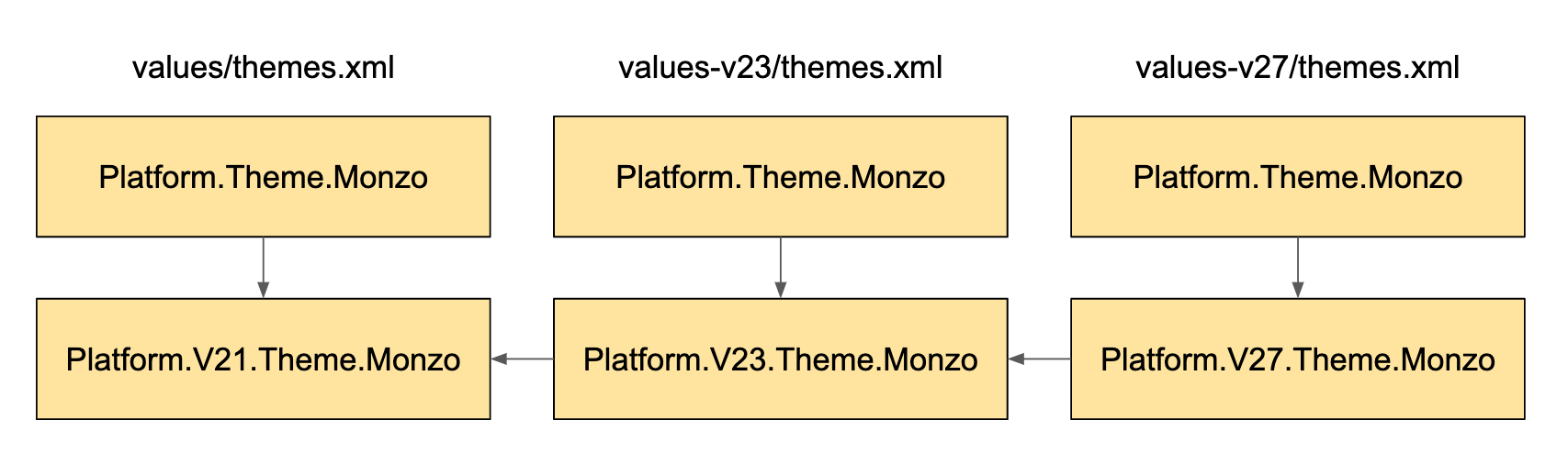
This works based on the following principles:
Platform.Theme.MonzoPlatform.Theme.Monzo is defined in each resource bucket where we need version-specific attributesPlatform.Theme.Monzo depends on a version-specific theme resource, e.g. Platform.V23.Theme.MonzoWe chose Theme.MaterialComponents.Light.NoActionBar as the framework theme to inherit from. The framework theme provides lots of sensible defaults so that we don’t have to specify everything.
Nick Rout wrote an article describing how to migrate from an AppCompat to MaterialComponents theme, and this showcases some of the things we get for free by inheriting from a framework theme (rather than creating our own from scratch).
So that’s the structure we’re looking to get to, but what steps can we take to help us there?
With so many themes and styles, it was difficult to know where to start. Part of this difficulty lay in the fact that it wasn’t clear how themes were used because it wasn’t always clear which style resources were themes. We decided to adopt a strict naming convention to help us navigate the current state of the app.
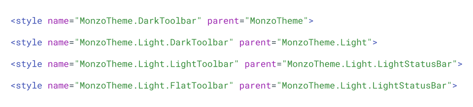
The first rule we agreed on was to take advantage of dot notation where possible, reserving the usage of an explicit parent for two cases only:
This made it really easy to see the lineage of a theme by removing the indirection:
This grouped themes into families, which made it easier to reduce the number of themes using a project-wide “Find and Replace” (⌘⇧R):
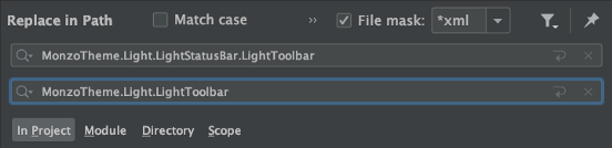
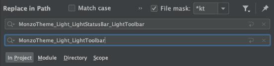
Here we’re replacing all *LightStatusBar.LightToolbar variants with *LightToolbar; if it’s a light toolbar, the status bar ought to be light anyway!
De-tangling what was left of the 22 themes was made easier by adopting naming prefixes:
Theme.Monzo for app themesThemeOverlay.Monzo for theme overlaysWidget.Monzo for widgetsThemes, theme overlays and styles are distinct concepts on Android, but they’re all represented as style resources; being stricter with names means that the resources will have less chance of being misused. For more information on the difference between themes and styles, check out “Android Styling: Themes vs Styles”.
Although renaming resources and collapsing very similar themes helps reduce our hierarchy into a manageable number of understandable themes, we still need to collapse our multi-tree setup into one.
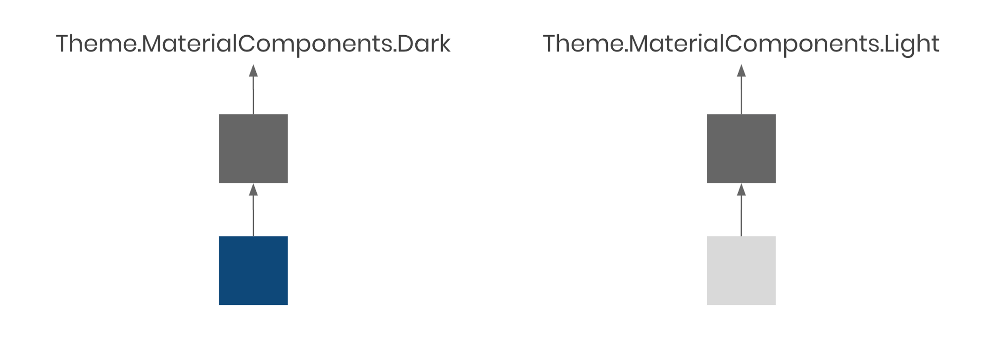
Multiple trees means that we have to duplicate attributes in the base of each tree which is problematic because we still have the issue where it would be easy to make a change in one but forget the other. The fastest way forward is to merge the base and root app theme in each tree, by moving all the attributes from each base into the corresponding root app theme:
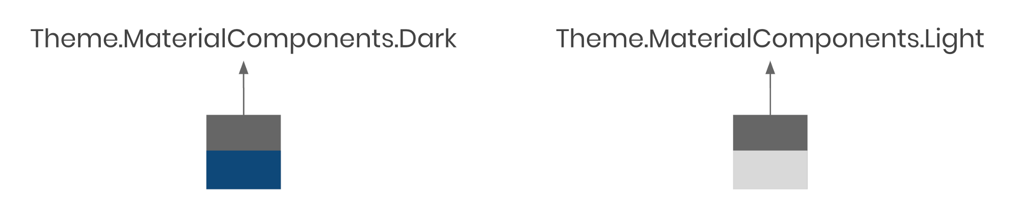
From here, we can re-parent Theme.Monzo.Dark and Theme.Monzo.Light with a new (empty) base:
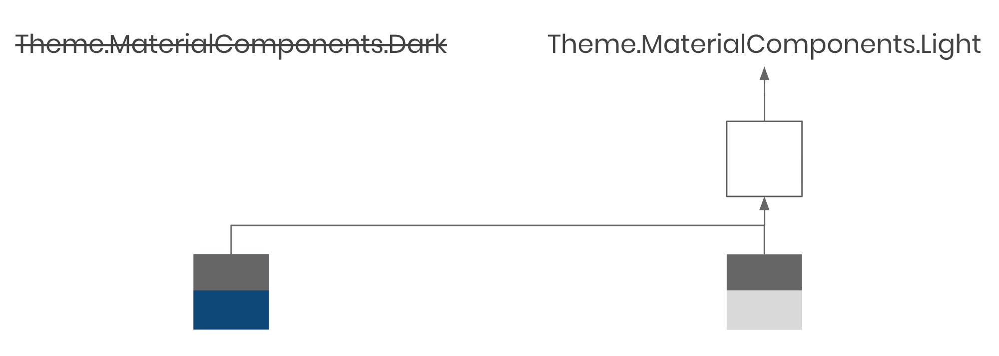
Re-parenting a theme can introduce unexpected bugs. In this case, we had to be careful to check that usages of Theme.Monzo.Dark didn’t depend on any colour-specific attributes from Theme.MaterialComponents.Dark. If we didn’t, components might have changed colour when we re-parented this theme as a descendent of Theme.MaterialComponents.Light.
For the Monzo app, we often used light themed components in both themes (e.g. dialogs and pop-up menus), which meant that these attributes were overridden to force light styles anyway. This meant there were no major regressions.
Now we’ve got a single tree, it’s possible for us to add the platform layer. This helps us handle a few specific attributes:
android:windowLightStatusBarandroid:windowLightNavigationBarwhich are available on API 23 and 27 respectively. They both inform the system whether the status bar (or navigation bar) is light, so that the system can choose to provide light or dark icons.
These attributes aren’t set in isolation: they relate to android:statusBarColor and android:navigationBarColor. Even though these are available from older API versions, we don’t want to set them separately from the ones above. Instead, we create custom theme attributes as an abstraction.
Creating a custom theme attribute is a case of declaring it as an attribute resource in a values resource file with a name and format:
<?xml version="1.0" encoding="utf-8"?>
<resources>
    <attr name="preferredStatusBarColor" format="color" />
    <attr name="preferDarkStatusBarIcons" format="boolean" />
</resources>
Then we can use these in our app themes like any other theme attribute:
<style name="Theme.Monzo.Light" parent="Base.Theme.Monzo">
    <item name="preferredStatusBarColor">@color/off_white_darker</item>
    <item name="preferDarkStatusBarIcons">true</item>
    <!-- ... -->
</style>

<style name="Theme.Monzo.Dark" parent="Base.Theme.Monzo">
    <item name="preferredStatusBarColor">@color/navy_darker</item>
    <item name="preferDarkStatusBarIcons">false</item>
    <!-- ... -->
</style>
By itself, this won’t do anything except assign values for these attributes. We can put them in our platform-specific themes to ensure that we only set attributes which are meant to be coupled, like android:windowLightStatusBar and android:statusBarColor, together:
<?xml version="1.0" encoding="utf-8"?>
<resources>

    <style name="Platform.V23.Theme.Monzo" parent="Platform.V21.Theme.Monzo">
        <!-- Controls whether status bar icons are light/dark - `minSdkVersion 23`-->
        <item name="android:windowLightStatusBar">?attr/preferDarkStatusBarIcons</item>

        <!-- Available on `21`, but we'll only set them alongside the above to avoid hard-to-read icons   -->
        <item name="android:statusBarColor">?attr/preferredStatusBarColor</item>
    </style>

    <style name="Platform.Theme.Monzo" parent="Platform.V23.Theme.Monzo" />

</resources>
Now, both status bar attributes will be set together only on v23 and above, and they’re configurable from each app theme.
We’ll look at default styles and how they help us de-duplicate code, improve consistency, and strengthen our themes - check it out here!
In the meantime, please let me know if you found this post helpful, or if you have any comments or questions (or corrections!), let me know on Twitter:
I wrote about how we at @MakingMonzo approached the seemingly overwhelming task of tidying our themes on Android. Check it out and let us know how you'd have tackled this in your projects!
— ataúl ✏️ (@ataulm) April 30, 2020
Thanks @emmaguy @chrisbanes for the 👀 #androiddev #gde https://t.co/rZOftd4z8G